Thursday, October 30, 2014

Spooky!


I've been doing tons of Christmas cards lately, and since tomorrow is Halloween, I thought I'd get in the spirit of the current season!  So, I'm joining in CASology today where the Cue Card is Ghost, and Simon Says Stamp Wednesday Challenge - Anything Goes!.


                                                    Simon Wednesday Challenge Blog


I started off by cutting a mask for the ghost shape (hopefully it doesn't just look like a blob!) and placing it on my watercolor paper.  Then I inked up the rest of the paper with my VersaMark ink pad.  I removed the mask and dried the clear ink with my heat tool.  Then I blended some distress inks over the whole thing then took a wet brush and brushed over the ink to smooth it out and give it a more watercolored look.  You can keep adding ink with your brush until you are happy with the look.  Then I used the reverse mask to cover the sky and sprayed a shimmer spray over my ghost figure.  I added a few stars (W&W)  and the sentiment on the banner (Lawn Fawn) embossed in classic pewter, then distressed the edges of everything.


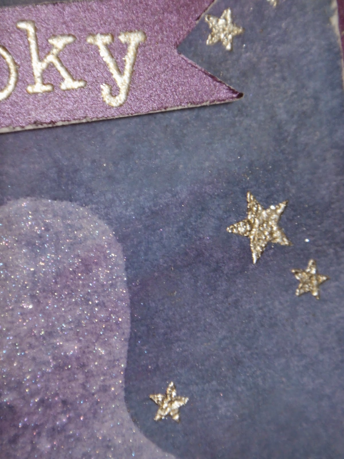
The absorbtion difference is quite dramatic.  The same color coverage was applied to the whole paper but the Versamark just sucks in the color!  Here is a  different card I used the same technique with.

Thanks so much for looking!
Karen


Wednesday, October 29, 2014

Merry Christmas times three!

This week's Muse Challenge is to make a set of 3 cards with a shared theme, using a single sheet of designer paper.


My theme is 'Green/Red/White Graphic Merry Christmas' since all three cards say Merry Christmas (in black) and are quite graphic.  I've had this paper in my stash for a few years and thought this was the perfect challenge to put it to use.  I think it's bright and cheerful, and just needs a few extra touches to make some very festive cards.  I don't usually use pattern paper, but these cards were so quick and easy to make, I just might have to use it more often!


After covering the entire card base with my designer paper, I die cut 3 each of the words Merry & Christmas (PTI - Wet Paint holiday dies) and stacked them together to give them some dimension.  Next, I cut 2 banners (PTI - Sketched Shapes) and mounted the words, giving them a coat of glossy accents.  I mounted the banners with foam dots then tucked in some red bling for a bit of sparkle.


This card required some fussy cutting to make the diagonal opening across the card. I used the piece I cut out to get the spacing of the gap just right.  I put a light pencil mark of where the opening was going to be, then stamped (Wplus9 - hand lettered holiday) and clear embossed the sentiment.  I mounted the designer paper onto some white card stock to give it more stability then used foam dots and mounted them to the base.  I added some of that same red bling over some of the red dots to give some sparkle.


I think this is my favorite card of the three and the first one of the set I made.  I fussy cut the connected diamond shapes then stamped and clear embossed the word Merry (Lawn Fawn - Clark's ABC's) and Christmas (PTI - Phrase Play #8)I popped up the patterned paper with foam dots and put Glossy accents on the red dots of the paper. After rounding the corners, I thought it needed something to balance it out.  I would have loved to scatter a few clear sequins in the top part, but I don't have any, so I added the ribbon.


I guess another theme is foam dots since I used them on all three cards! 

Thanks so much for looking!
Karen


Thursday, October 23, 2014

Hudson Bay Point Blanket


Any Canadians should recognize this immediately, it's the design of a Hudson's Bay Point Blanket which is iconic Canadiana.  
Being Canadian, this makes me feel like home.  We had a couple of these woolen blankets when I was growing up and they were snuggly warm on a cold winter's night.

Edited to add:  I'm thrilled my card got an Honorable Mention this week at CASology!
                                                                              

Sadly, the shooting in Ottawa yesterday means some families will need some comforting.  This blanket to me is a symbol of support, unity and love.

I used a light colored textured kraft cardstock and blended distress ink over masked off stripes.  It looks fuzzy, just like the real thing!  The small four straight black lines are the "points" of the blanket.  The points indicate the size of the blanket: the more points, the bigger the blanket therefore the more it is worth.  I have a stamp coming that says "snowy days are for snuggling" I would have loved to have used, but since it hasn't arrived yet, I put my finished card through the printer (holding my breath!) and printed a different sentiment. On the picture it looks like I Photoshopped the words in but they really are printed on the card - I would have lined them up better if it was Photoshopped!


I inked up the front and the back of the card so it looks just like a blanket!

(The blue is showing very bright on these two pictures - the top picture is the true color)


I'm putting this in  CASology cue card Home and Simon Says Stamp Wednesday Challenge Blog use kraft.


Irrelevant Info: When my dad first emigrated to Canada from England in the late 1950's he actually worked for the Hudson Bay Company in Northern Ontario right on the actually Hudson's Bay.  Believe it or not, he was in the ladies lingerie department! Lingerie means something entirely different now-a-days.


Thanks for Looking,
Karen


Wednesday, October 22, 2014

Stars Parade Happy Holidays


I'm squeezing one more card in for both Festive Friday  and CAS(E) this Sketch.  
I'll join into Simon Says Stamp Monday Challenge as well.


I used the Simon Says Stamp Stars Parade Die and cut out some red metal, silver glitter paper and some shiny irrisdescent white cardstock to make a festive pattern.  Sentiment PTI.  The sentiment is easier to read in real life.


Thanks for Looking!
Karen

Sunday, October 12, 2014

Jolly


Here's another super quick card that has not one bit of stamping on it!  I just added a strip of black cardstock along the bottom, cut some silver glitter paper with MFT's retro squares base die, and then cut some red metal with the matching frame.  The jolly sentiment is an extremely old Pebbles sticker (It looks out of focus because the letters on the stickers have a white shadow to make them look like they are really a label but they are just flat stickers).

This is going in to CAS(E) this Sketch!  and  Festive Friday.


This is my second entry for Festive Friday since I seem to be on a Christmas card kick today!


The cardstock is really crisp white, unfortunately it looks ivory here. I might try to retake the picture during the day tomorrow to see if it comes out better.

Thanks for Looking!
Karen

Let it Snow


This weeks Muse Challenge has been rolling around my brain all week.  I love the simple, classic look of the Muse card! You can't get much more basic than stamping and embossing, but it's a timeless look.  
I'm also putting this in for  Clean and Simple on Sunday. Where the challenge is to emboss it.

For your blog                                                                        


I used PTI's Snowflake Flurries stamp set, classic pewter embossing powder and white embossing powder.


Whoa, the color on the second picture sure is wonky!

Thanks for Looking!
Karen

Friday, October 10, 2014

Happy Halloween


Here's my stab at The Card Concept's Color Challenge.   I think it's Clean and Simple?  

Oh, I may as well join in with CASology this week. The cue card is splatter and there is definitely a splatter of orange on this card.


It is definitely quick to make, Sizzix embossing folder on black cardstock.  Top that with a piece of white cardstock spritzed with orange.  Two quick stamps, tear off some corners, add some white gel pen on the teeth to make them pop and it's done!  


I wish my teeth were that white.

Thanks for Looking!
Karen 

'Tis The Season


Boy, I didn't realize how long it's been since I posted on my blog!  I was busier than I thought obviously.

Here's my card for the latest challenge at Festive FridayI love the inspiration picture, crisp white with great pops of red and green.


Very simple card... Stamps are PTI with some green and clear gems for some seasonal bling.


Thanks for looking!
Karen